A First Impression of OpenTodoList
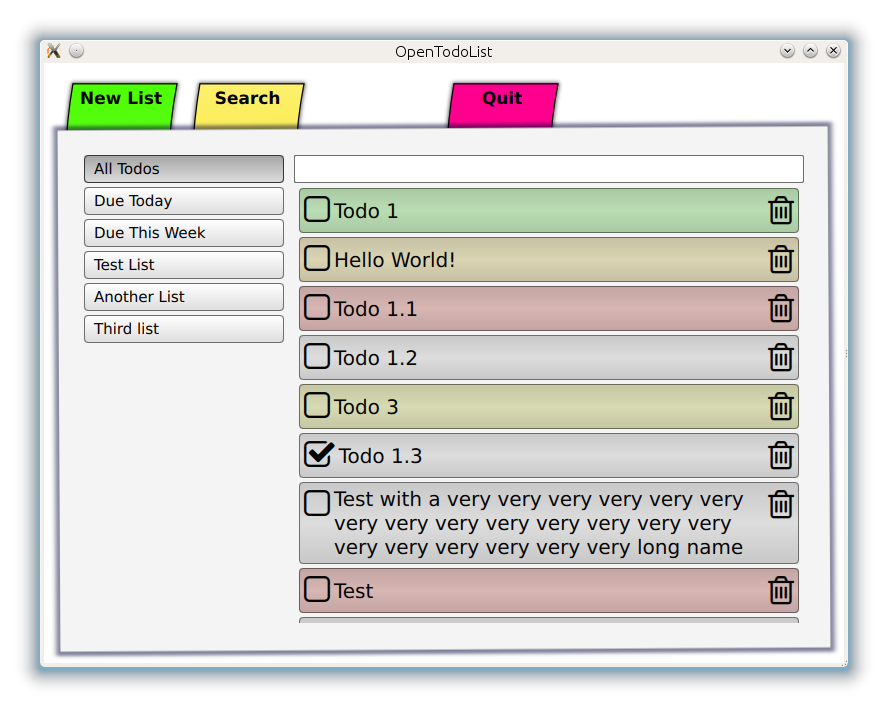
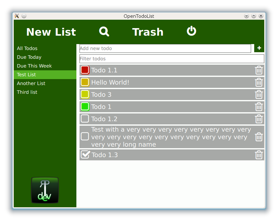
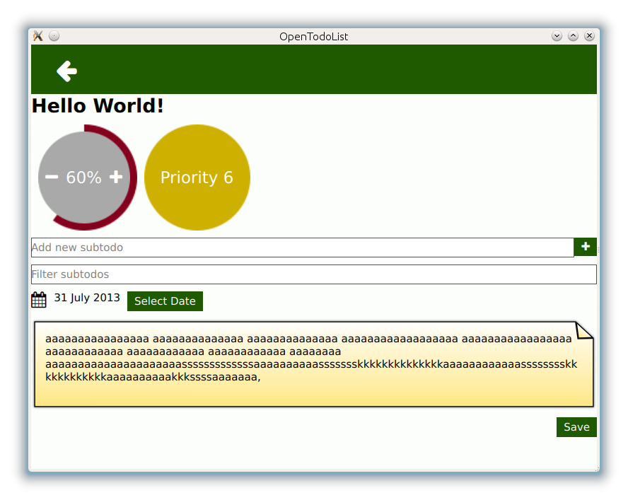
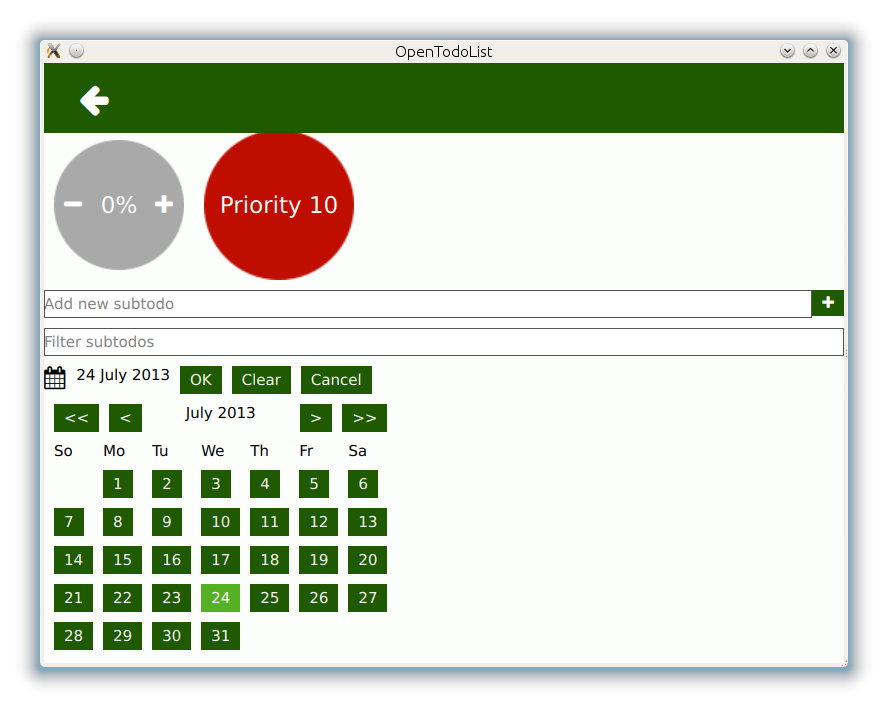
So some weeks back I came to the conclusion that it would be a good idea to write a todo list application. So far so good. Unfortunately, a lot of my past projects have got stuck somewhat in the very beginning of their development phase. I do not claim that OpenTodoList had an easier life. In fact, due to I have only a little spare time left nowadays, finding some to invest in such a “side project” is not easy. However, OTL had one advantage: I urgently needed a todo list app that fits my needs - especially at work ;) By the way, during the development, I stumbled upon an interesting topic (which meanwhile is probably not so unknown anymore): Flat design :) I’m not a designer, however, I found that design approach quite interesting and (of course) rewrote the UI parts of OTL in that fashion. Thanks to QML, that went quite easy - during one evening the UI was vastly ported. The transition is definitely not finished yet (and again, I’m not a designer, so there’s definitely still a lot to learn about good design). Now, enough words, see some before and after pics below. Enjoy :)
